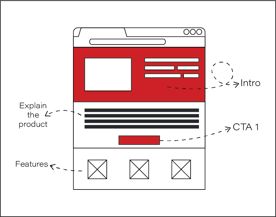
Learn how to order your content for maximum lead generation
One of the most important parts of on-page content marketing is the order of your content. Much like a story, with an introduction, a body, and a conclusion, your content needs to flow in a logical manner.
But in addition to this, you’ll also want to make sure your content is ordered effectively. If your content is ordered in a muddled, irrelevant way then you’re going to have trouble generating leads.
So regardless of the type of content you’re writing, you’ll want to keep your content hierarchy in mind.
After applying what you’ve learnt, your on-page content will effectively guide your customers through the sales funnel to your call-to-action.
Understanding what content hierarchy is
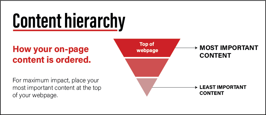
Much like an inverted pyramid, a content hierarchy involves placing your most important content at the top of a page, where it will be the first thing that people see.
The second section of content will be slightly less important, and so on, until you end with the least important content at the bottom of the page.
Content hierarchies are very common in the digital marketing industry, and appear in newsletters, email campaigns, website content and more.
The need for content hierarchy
It’s no surprise that the digital age we live in has made data incredibly accessible. But while we are able find all the information we need at our fingertips with a quick Google search, we also have to wade through a lot of irrelevant information to get there.
To prevent this high volume of information from becoming overwhelming, our brains have become adept at finding the target content, and filtering out the collateral.
This means that our attention spans are really short.
Companies and adverts have very little time to capture our interest before we get bored and look elsewhere.
Content hierarchy aims to address consumers’ short attention spans by ensuring that they find the important information that is relevant to them as quickly as possible.
Without a strategically-designed hierarchy, your content runs the risk of being completely disregarded.
More specifically, it would face a high bounce rate, and low average session duration – two things that significantly hamper your lead generation efforts.
Bounce rate
What bounce rate is
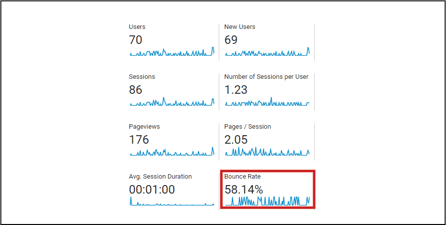
Bounce rate is a calculation that shows the percentage of users that enter one of the pages on your website and then leave without further interaction or engagement.
This means that they landed on the page, scrolled around a bit, read some of your content, and then left without clicking any links or buttons, or navigating to another page on your site.
Bounce rate is calculated as follows:
Bounce rate = bounces / total visits
You can calculate the bounce rate for a particular page, as well as for your website overall.
What is a good bounce rate?
Bounce rates differ drastically between different industries, which makes it difficult to determine what an average or good bounce rate is. The average bounce rate of ecommerce websites, for example, will be very different to that of blogs or online dictionaries.
However, we can be sure about one thing – high bounce rates are typically not favourable. The lower your website’s bounce rate, the more engaging it is for visitors.
Why people bounce
There are two main reasons why people bounce:
-
- They found the information they wanted for their query and were satisfied.
They were never going to engage with your site in the first place.
-
- They could not find the information they wanted on your site. Your content did not engage them or they had a bad user experience.
They were looking to engage. Now they will try a different website.
In addition to other factors like site speed, creating a good hierarchy for your content should be one of the first things you do to address the second situation above.
Bad content hierarchy = high bounce rate
Let’s look at an example of a bad content hierarchy.
Someone lands on one of your service pages, and they are ready to engage. The page’s content is ordered like this:
- History of the website / brand
- Where the company is located
- FAQs
- Why people need the service
- Explanation of who the target market is
- What the service is
- Call to action
The visitor skims through the content – reading any headings and subheadings they can find while scrolling down the page – before realizing they can’t find the important, relevant information they’re looking for.
They leave the website; they have bounced.
It’s clear that if the ordering of your content is off, people aren’t going to stick around to locate what they’re looking for.
A bad content hierarchy will result in a high bounce rate.
Good content hierarchy = good bounce rate
Yet, a good content hierarchy can really help to reduce your website’s bounce rate.
To do this, you need to put the information that your target market is looking for in an easily-accessible place (the top of the page).
Don’t make them have to scroll for ages to find it – put it where it can’t be missed instead!
When your on-page content is well-structured, well-ordered and flows logically, you’ll be able to keep people’s attention.
You’ll be able to show them – in the shortest amount of time possible – what they need to see to choose your product or service.
And even if they do bounce, they will leave your website retaining at least some of its content.
The parts that they read. The parts at the top of the page.
And if they remember your most important information, then that means they could return to your website again in the future after having done some further research or shopping around.
But in addition to affecting your webpage’s bounce rate, content hierarchy also affects its average session duration.
Average session duration
What is average session duration?
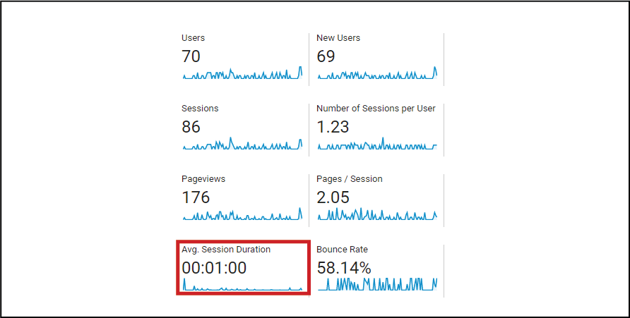
Average session duration refers to the typical length of time that users spend on a particular webpage. You can also modify the formula to work out an average across your entire website.
It is calculated by dividing the total length of all sessions on a webpage by the number of users that had those sessions.
Average session duration = total length of sessions / number of sessions
This calculation will, once again, differ between websites and industries. What is good for one site may be very high for another.
Attention spans & session duration
I’d mentioned at the start of this section about how people have very short attention spans.
In the context of session duration, this means that you only have a few crucial seconds to capture someone’s attention when they land on your webpage – and keep that attention as you guide them to take action.
People don’t tend to read webpages from start to finish – rather, they scan the page for any pertinent information as they scroll through it.
In fact, you only have 15 seconds on average to capture someone’s attention online.
Now, bear in mind that you don’t need to set the goal of having your website’s average session duration be 20 minutes long.
You just need it to be long enough for your users to find what they’re looking for, and then move on to the next step of your sales funnel.
However – 15 seconds isn’t long enough for that to happen.
Rather, you’ll need to maintain their attention for a few minutes at least. This will ensure they’re on your webpage long enough for its copy to convert them.
AIDA
AIDA is a great marketing principle that ties into session duration.
It is an acronym that stands for:
- Attention
- Interest
- Desire
- Action
AIDA helps content marketers maintain their users’ attention while guiding them to take an intended action.
It also ties into another component of on-page design: above the fold content.
When someone lands on your webpage, the only content they can see is content that is above the fold. Everything below the fold is not initially visible – you have to scroll down in order to see it.
It’s good for user experience to keep your most important, engaging content above the fold, and not require users to scroll too far to find it.
In addition to above the fold content, other factors come into play with AIDA too, like keeping your text readable, using informative headings and subheadings, and breaking up your content with visuals, bullet points and other formatting techniques.
Content hierarchy & AIDA
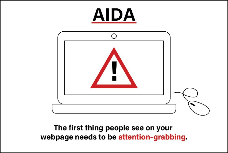
Fortunately, a smart content hierarchy will help with both AIDA and session duration.
When your content is laid out and ordered correctly, it will grab visitors’ attention. This is because they will instantly see the most impactful part of your message to them.
This means that users will spend more time on your webpage reading its content, and their interest will grow.
It takes time to convince people to trust your brand, and to choose to work with it. The longer you can keep and maintain their interest, the greater your chances of convincing them to desire your offering.
Finally, once you’ve successfully persuaded your users and they want what you’re offering, they will take action.
They will click the link or the call-to-action button, and you will have landed a new lead.
That’s how content hierarchy helps keep your session duration long enough for people to engage. It grabs their attention from the get-go and moves them through the AIDA model towards a conversion.
How to organise your content into the perfect hierarchy
Lay your content out
When coming up with the optimal hierarchy for your content, start by deciding what the most critical information in your customer journey is. Ask yourself, ‘if I were a customer looking to buy my own product or service – what’s the first thing I’d want to see?’
Put this at the top of the page.
Thereafter, as you decide on ordering the rest of your content, remember to keep the overall flow of the page in mind.
You still need to have a proper introduction, body and conclusion for your content.
Your content hierarchy fits within this framework. Each proceeding piece of content needs to carry on from the one before, and fit well with the next.
Once you’ve put your content hierarchy together – examine it closely. It should not feel disjointed or illogical.
Rather, it should be well-structured, congruent, and help transition first-time visitors to customers.
Use a sample content hierarchy
The right content hierarchy for one website or industry won’t always be appropriate for another.
However, here’s a very general template that you can use as guidance for coming up with your own.
This content hierarchy is for a business’s service page:
- Introduction – identify the need or problem that your target audience has
- Explain your service
- How your service solves that problem
- What the benefits or features of the service are
- Position your brand as being better than its competitors
- Answer any relevant FAQs
- Conclusion – summarise your service and let users know what the next steps are
Insert calls-to-action
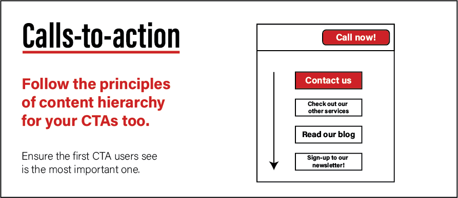
Once you’ve set out the basic outline of your content hierarchy, it’s time to insert your calls-to-action.
Regardless of the types of call-to-action you will include (newsletter signup, proposal form etc), you’ll want to use multiple and spread them throughout the page
However, if you want to use a variety of calls-to-action, rather than just one type, make sure you put the most important one first.
For example, if your ultimate goal is to get more customers, you’ll want to have a ‘contact us’ call-to-action appear before a ‘sign up to our newsletter’ call-to-action.
After reading this article, you now have all the information you need to construct a winning content hierarchy. You’ll keep visitors engaged while showing them all the reasons why they should click on your call-to-action.
Content hierarchy for informative pages
Informative vs sales pages
Throughout this article, we’ve focussed on service and product pages.
But what should your content hierarchy look like if you’re writing a more informative and less sales-oriented page, like a blog post or article?
The most important parts of this content are the findings that you want to present, or what you want to teach people.
Yet informative pages often have a lot of supporting content, in addition to their focus sections. Supporting content could be the benefits the article will give you, background as to why the author is writing the page, etc…
If you were presenting a study, then your supporting content could include your hypothesis, methodology and a discussion on your results.
Supporting content gives your readers more contextual understanding, to be used in conjunction with your focus content. Without that context, your readers can get lost.
When you’re setting out the content hierarchy of an informational page, you still want to place the most important content towards the top, but you need to focus on the overall flow of the page too.
More so than for product or services pages.
Focus on flow & context
Going back to our example of a study, it would be confusing if your content hierarchy placed your results at the very top of the page. Your readers need to first get familiar with what your study was about before they can interpret the results.
SImilarly with a blog post, if you’re teaching people about a topic they don’t know about, then it doesn’t make sense to have a ‘How to do X’ section first, when they don’t even properly understand what X is, and why they should care about it.
For informative pages, make sure to introduce your readers to the topic first. Give them any relevant contextual information they need before progressing to your most important section.
Thereafter, order your remaining content in descending order of importance.
But make sure your contextual information is relevant. You still don’t want people to have to scroll for too long before they find what they’re looking for.
Recipe blogs are notorious for trying to give so much (oftentimes irrelevant) context that the recipe directions themselves fall to the bottom of the page. See an example here.
Sample informative content hierarchy
This informative content hierarchy sample is for a blog page teaching people how to do X:
- Introduction
- Important context for the topic
- How to do X / The X process step-by-step
- The benefits of doing X
- Additional reading
- Conclusion
It can easily be adapted for a variety of purposes. Just make sure to not dive into the topic too quickly – take the time to introduce your readers to it properly.
Benefits of content hierarchy
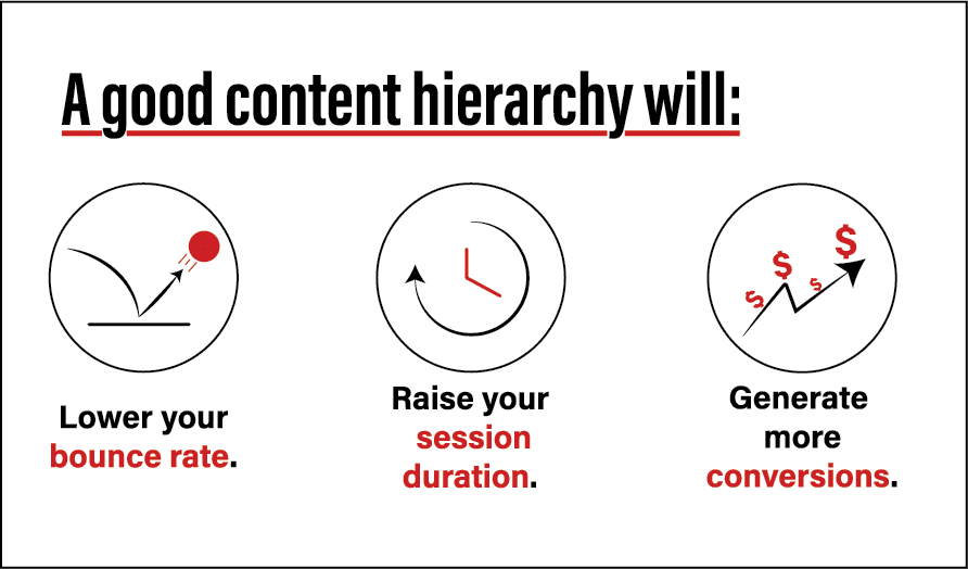
Strategic placement of your content is going to help your website in the following ways:
Lower bounce rate & higher session duration
As discussed above, by making attention-grabbing, relevant content the first thing people see when they land on a webpage, you’re going to get them to stay on that page, and spend more time reading the rest of the content.
More conversions
Proper content hierarchy means putting the information users want to see first. This grabs their attention and piques their interest to learn more.
Once they’ve discovered more about your brand and offering, and your message has convinced them to, they’ll sign-up / call now / fill in a form, or continue reading another page on your site.
Your content hierarchy successfully moved them through all of the copy you’d written, and positioned your calls-to-action as the next step for them.
And furthermore – if people leave your site without engaging, then you stand a better chance of having them come back at some point, since the most important, convincing parts of your message were the first things they read, and what they will remember.
If you have any questions about setting up the perfect content hierarchy for your website, or just want to know more, get in touch with us and let’s level up your content marketing.
